## What

Adjust the highest-index chart color variables so adjacent segments stay
distinguishable:

- **Light mode:** `--chart-9`/`--chart-10` use darker zinc shades
(`zinc-700`/`zinc-600`) instead of the near-white `zinc-100`/`zinc-50`,
which were invisible against the light background.
- **Dark mode:** `--chart-7`/`--chart-8` use lighter zinc shades
(`zinc-200`/`zinc-300`) instead of the near-black `zinc-800`/`zinc-900`.

## Why

Charts with many categories were rendering low-index and high-index
segments at nearly the same value as the background, making them
unreadable.
## What

Bump the dark-mode `--input` color from `oklch(0.269)` to `oklch(0.41)`.

## Why

In dark mode the `--input` value sat almost on top of the background
(`oklch(0.225)`), so the shared `border-input` was nearly invisible on
every form control. Checkboxes were especially hard to spot.

Since inputs, checkboxes, radios, selects and textareas all share
`border-input`, this single variable raises their border contrast at
once (Δ luminosity vs background goes from 0.044 → 0.185) while staying
below the focus ring (`0.439`), so focus still stands out and every
control keeps a consistent design.

As a nice side effect, the subtle `bg-input/30` and `bg-input/50` fills
(radio, outline button) also read a touch more clearly.
## Summary
- add safe-area CSS variables for the viewport top and bottom insets
- apply safe-area-aware collision padding to the shared popover
primitive so iOS overlays stay below the notch
- add a focused regression test for the popover safe-area guard

## Testing
- vendor/bin/pint --dirty --format agent
- php artisan test --compact tests/Feature/PopoverSafeAreaTest.php
## Summary

- Rework the neutral (default) chart color scheme for light mode to
improve contrast distribution and visual variety
- Adjusts `--chart-1` through `--chart-9` zinc shade assignments for
better differentiation between chart segments
## Summary

- Add a new **Chart color scheme** dropdown in Settings > Appearance
allowing users to choose between 4 color palettes: **Colorful** (new
default), **Neutral** (previous zinc grayscale), **Blue**, and **Pink**
- Persist the setting in a new `user_settings` table with instant
client-side feedback via localStorage + cookie
- All charts across dashboard, categories, budgets, and cashflow update
instantly when switching schemes
- Reduced colorful palette intensity (shifted from 500/600 to 300/400
range) for lower contrast
## Summary
- Redesign the landing page with a screenshot-driven layout replacing
placeholder icons
- Add real screenshots (light + dark mode) for all feature sections:
accounts, transactions, privacy, import, budgets (list, detail, edit),
and cashflow
- Update fonts to IBM Plex and refine section spacing, testimonials,
pricing, and FAQ

## Test plan
- [ ] Verify all feature screenshots load correctly in both light and
dark mode
- [ ] Check responsive layout across mobile, tablet, and desktop
- [ ] Confirm lazy loading works for images below the fold
## Summary

- Replaced the broken `fade-bottom` header with a floating **pill menu**
on mobile (matching the dashboard bottom nav style)
- Fixed landing screenshot images using `w-full` instead of `h-full
w-auto` for proper aspect ratio on mobile
- Reduced skew/rotation transforms on mobile for better readability
- Removed unused `fade-bottom` CSS class

## Changes

### Header (`header.tsx`)
- **Mobile** (`< sm`): Floating pill with `rounded-full`, glassmorphism
(`bg-background/70 backdrop-blur-xl`), positioned at `top-4` with
margin. Compact logo + auth buttons with `size="sm"` and `rounded-full`.
- **Desktop** (`sm+`): Clean fixed header with `bg-background/5
backdrop-blur-lg` (unchanged from original). All nav items (Github,
Discord, auth) preserved.

### Landing images (`welcome.tsx`)
- Changed images from `h-full w-auto` to `w-full` for proper responsive
aspect ratio
- Added `max-sm:` variants to reduce rotation/skew on mobile (`-16deg/8`
instead of `-24deg/12`)

### CSS (`app.css`)
- Removed unused `.fade-bottom` class

## Screenshots

### Mobile (390x844) — Pill Header
<img
src="https://raw.githubusercontent.com/whisper-money/whisper-money/fix/welcome-page-mobile-ios/.github/pr-screenshots/pr-mobile-hero.png"
width="300" />

### Mobile — Images Section
<img
src="https://raw.githubusercontent.com/whisper-money/whisper-money/fix/welcome-page-mobile-ios/.github/pr-screenshots/pr-mobile-images.png"
width="300" />

### Desktop (1440x900)
<img
src="https://raw.githubusercontent.com/whisper-money/whisper-money/fix/welcome-page-mobile-ios/.github/pr-screenshots/pr-desktop.png"
width="800" />

## Test plan

- [ ] Verify pill header displays correctly on iOS Safari (physical
device or simulator)
- [ ] Verify header buttons (Log in, Register) work on mobile
- [ ] Verify desktop header is unchanged with all buttons (Github,
Discord, Log in, Register)
- [ ] Verify landing images display with correct aspect ratio on mobile
- [ ] Verify dark mode works for both mobile pill header and desktop
header
## Summary
- Load the previous budget period (with transactions) in
`BudgetController::show()` and pass it to the frontend
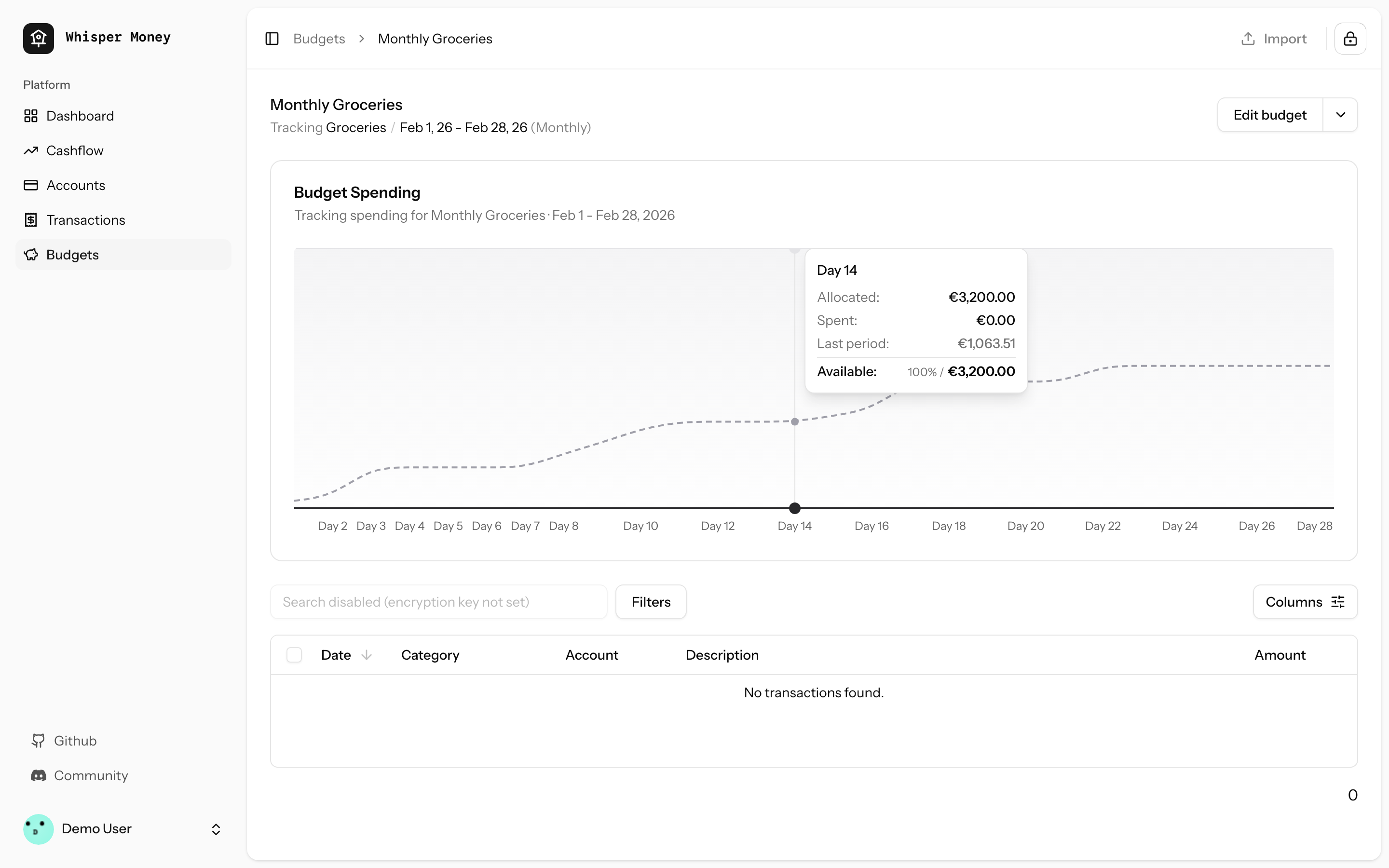
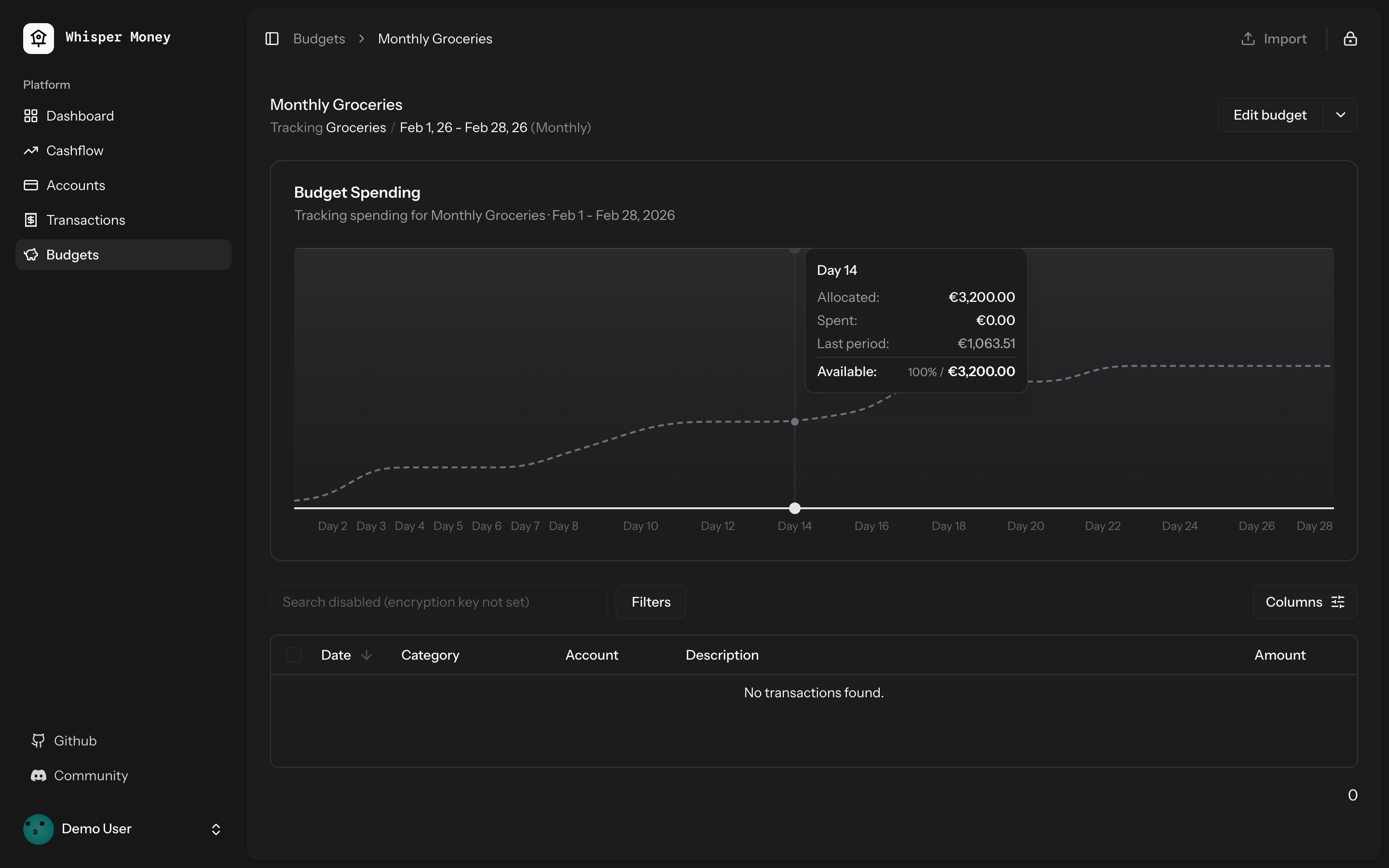
- Overlay previous period's cumulative spending as a dashed line on the
budget spending chart
- Use day-of-period alignment (Day 1, Day 2...) when comparing so
periods of different lengths align
- Tooltip shows both "Spent" (current) and "Last period" values when
hovering
- Chart now shows the full period timeline (not just up to today)
- When no previous period exists, chart behavior is unchanged
## Screenshots
### Light mode
### Dark mode
## Test plan
- [x] Tests pass: `php artisan test --compact
tests/Feature/BudgetTest.php` (9 tests)
- [x] Pint formatting passes
- [x] ESLint + Prettier pass
- [ ] Manual: view a budget with a prior period — dashed line appears
- [ ] Manual: view a budget with no prior period — chart unchanged
## Overview

We're excited to introduce budgeting capabilities to Whisper Money! This
feature helps you take control of your finances by setting spending
limits and tracking your progress over time.

## Screenshots
<img width="1316" height="793" alt="image"
src="https://github.com/user-attachments/assets/ac394d36-cded-4ea4-9883-120785e260f1"
/>
<img width="1315" height="907" alt="image"
src="https://github.com/user-attachments/assets/7c682474-5aa7-4388-b626-29b56f5ebbef"
/>
<img width="1315" height="992" alt="image"
src="https://github.com/user-attachments/assets/21eace45-23c6-472d-9aa0-0feb6db3fba4"
/>

## What's New

### Create Flexible Budgets
- Set budgets for specific categories or labels
- Choose from monthly, weekly, bi-weekly, or custom periods
- Set your own budget start date for better alignment with your pay
schedule

### Track Your Spending
- Visual spending charts show how much you've spent vs. your budget
- See at a glance which budgets are on track and which need attention
- View all transactions that count toward each budget

### Smart Budget Management
- **Carry Over**: Unused budget amounts automatically roll into the next
period
- **Reset**: Unused amounts return to your available money pool
- Edit or delete budgets anytime as your needs change

### Easy Access
- New Budgets section in the main navigation
- Quick overview cards showing budget status
- Detailed budget pages with spending history and transaction lists

## How It Works

1. Create a budget by selecting a category or label and setting your
spending limit
2. Your transactions are automatically matched to relevant budgets
3. Track your progress with visual charts and spending summaries
4. Adjust your budgets as needed to stay on track with your financial
goals

This feature is now available behind a feature flag and can be enabled
for users who want to start budgeting their expenses.
 Víctor Falcón



