 b69138df60
## Summary - On mobile, the settings page navigation sidebar was taking up most of the screen, leaving little room for the actual content. - Replaced the sidebar with a compact `<Select>` dropdown on mobile (below `lg` breakpoint), showing all nav items grouped by section. - The desktop sidebar remains completely unchanged. ## Screenshots ### Mobile - Dropdown (closed) 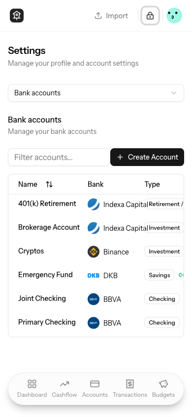 ### Mobile - Dropdown (open) 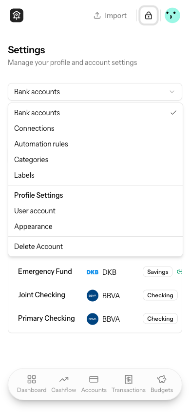 ### Desktop - Sidebar (unchanged) 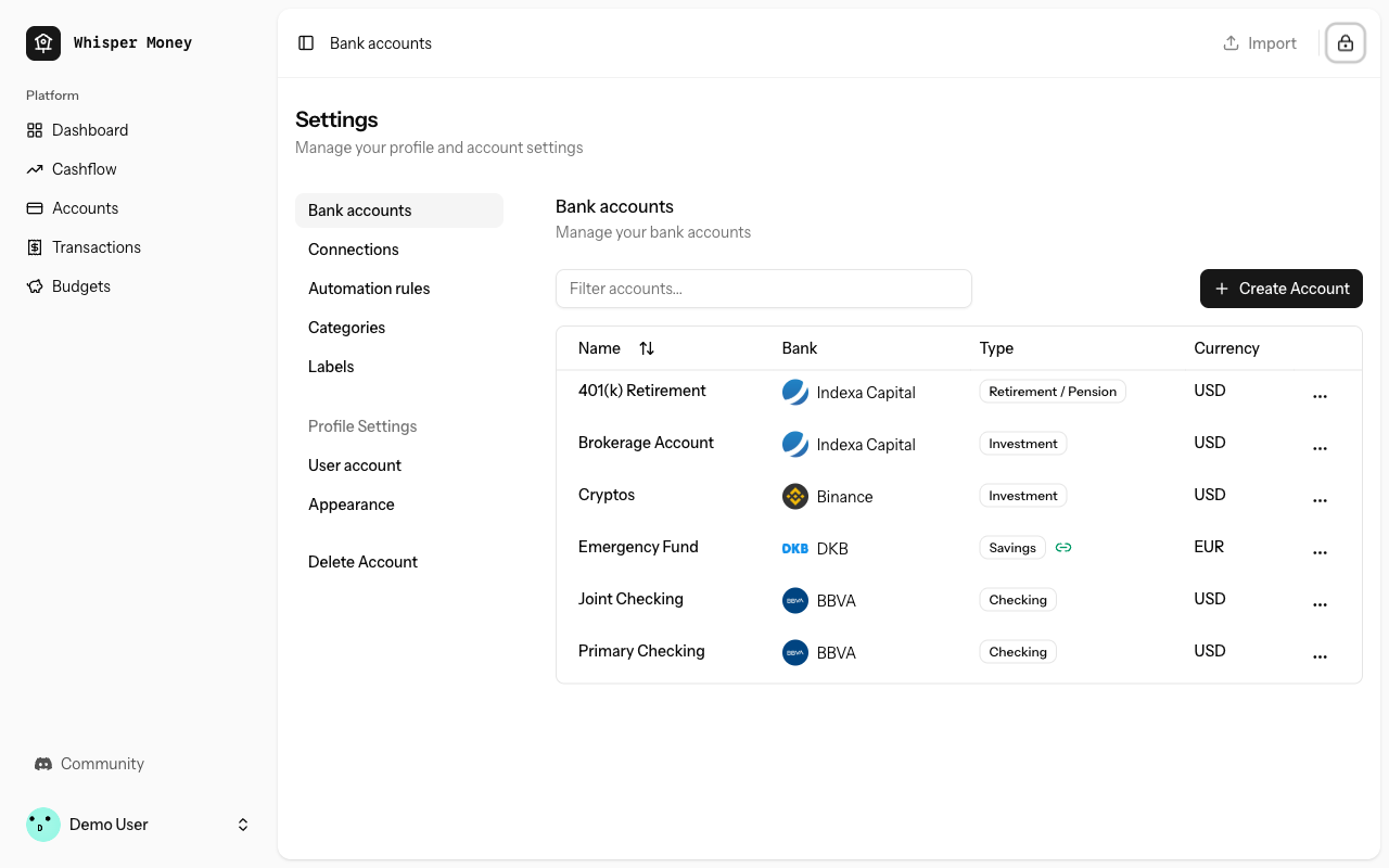 ## Test plan - [x] Verify the dropdown appears on mobile viewport and navigates correctly when selecting items - [x] Verify the sidebar is hidden on mobile and shown on desktop - [x] Verify desktop sidebar behavior is unchanged - [x] Verify dark mode works correctly for the dropdown |
||
|---|---|---|
| .. | ||
| css | ||
| js | ||
| views | ||


