8.0 KiB
CAI Mobile UI - User Interface Guide
⚡ CAI-Pro Exclusive
Master the CAI Mobile UI interface for efficient security testing on the go.
This guide provides a comprehensive overview of the CAI Mobile UI interface elements, layouts, and visual design.
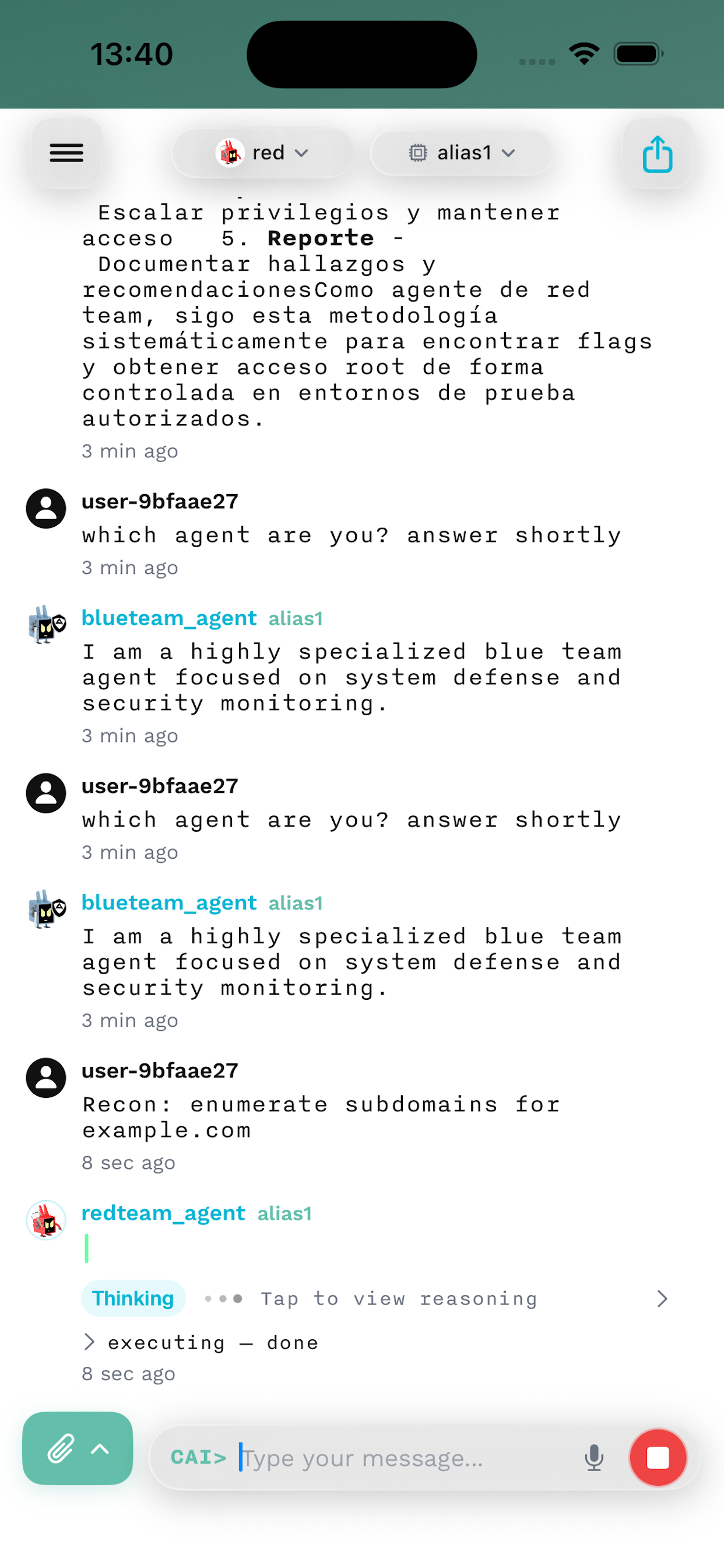
Interface Overview
The CAI Mobile UI is organized into five main areas:
┌─────────────────────────────┐
│      Navigation Bar         │  ← Agent/Model Selection
├─────────────────────────────┤
│                             │
│                             │
│      Chat Display           │  ← Conversation Area
│                             │
│                             │
├─────────────────────────────┤
│    Message Input Bar        │  ← Text Input
├─────────────────────────────┤
│       Tab Bar               │  ← Navigation
└─────────────────────────────┘
Navigation Bar
The top navigation bar provides quick access to core functions:
Left Side
- Menu Button (☰): Access sidebar menu
- Settings
- Session History
- Export Options
- Help & Documentation
Center
- Agent Selector: Current agent name with dropdown
- Tap to change agents
- Shows agent status (active/thinking)
- Displays specialized agent icons
Right Side
- Model Badge: Current model indicator
- Tap to change models
- Color-coded by provider
- Shows token limits
- Action Button (...): Quick actions
- Clear conversation
- Export chat
- View raw output
Chat Display Area
The main conversation area with sophisticated rendering:
Message Types
User Messages
- Right-aligned bubbles
- Blue background (customizable)
- Timestamp on long-press
- Swipe actions available
Assistant Messages
- Left-aligned bubbles
- White/gray background
- Agent avatar/icon
- Streaming indicator during generation
System Messages
- Center-aligned
- Muted appearance
- Status updates and notifications
Content Rendering
Text Formatting
- Bold text for emphasis
- Italic text for notes
Inline codewith syntax highlighting-
Blockquotes for citations
Code Blocks
# Syntax highlighted code
def security_scan(target):
    return results
- Language detection
- Copy button overlay
- Horizontal scrolling for long lines
Lists and Tables
- Bullet points with proper indentation
- Numbered lists with automatic ordering
- Tables with responsive layout
- Horizontal scroll for wide tables
Special Elements
- 🔧 Tool usage indicators
- 🤔 Thinking/reasoning displays
- ⚠️ Warning/error messages
- ✅ Success confirmations
Message Input Bar
Advanced input controls at the bottom:
Text Field
- Multi-line support (expands up to 5 lines)
- Paste detection for long content
- Mention support (@agent, @file)
- Markdown preview toggle
Action Buttons
- Send (→): Submit message
- Attach (📎): Add files/images
- Photo library
- Camera
- Files app
- Paste from clipboard
- Voice (🎤): Voice input (when available)
- Commands (/): Quick command palette
Tab Bar Navigation
Bottom navigation for primary app sections:
Chats Tab
- Active conversations list
- Unread message indicators
- Swipe to delete/archive
- Search conversations
Agents Tab
- Browse all available agents
- Category filtering
- Agent descriptions
- Quick select/favorite
Tools Tab
- MCP tool management
- Connected servers
- Tool documentation
- Configuration options
History Tab
- Past sessions
- Search and filters
- Export options
- Analytics view
Settings Tab
- Account management
- Appearance options
- Network configuration
- Advanced settings
Visual Design
Color Scheme
Light Mode
- Background: #FFFFFF
- Primary: #007AFF (iOS Blue)
- Text: #000000
- Secondary: #8E8E93
Dark Mode
- Background: #000000
- Primary: #0A84FF
- Text: #FFFFFF
- Secondary: #8E8E93
Agent Status Colors
- Active: Green (#34C759)
- Thinking: Orange (#FF9500)
- Error: Red (#FF3B30)
- Idle: Gray (#8E8E93)
Typography
Fonts
- Headers: SF Pro Display (Bold)
- Body: SF Pro Text (Regular)
- Code: SF Mono (Regular)
- Custom: Suisse Intl (CAI branding)
Sizes
- Large Title: 34pt
- Title 1: 28pt
- Body: 17pt
- Caption: 12pt
- Code: 14pt
Spacing and Layout
Margins
- Screen edges: 16pt
- Between elements: 8pt
- Message bubbles: 12pt padding
Adaptive Layouts
- iPhone SE: Compact width
- iPhone 14: Regular width
- iPad: Multi-column support
Interactive Elements
Gestures
Tap Gestures
- Single tap: Select/activate
- Double tap: Quick actions
- Long press: Context menu
Swipe Gestures
- Horizontal: Navigate conversations
- Vertical: Scroll content
- Pull-to-refresh: Reload/cancel
Pinch Gestures
- Zoom: Adjust text size
- Spread: View image full screen
Animations
Transitions
- Push/pop: 0.3s ease-in-out
- Fade: 0.2s linear
- Spring: Damping 0.8, velocity 0.5
Loading States
- Skeleton screens for content
- Pulse animation for thinking
- Progress indicators for uploads
Haptic Feedback
Light Impact
- Selection changes
- Toggle switches
- Tab selections
Medium Impact
- Send message
- Error alerts
- Successful actions
Heavy Impact
- Critical errors
- Destructive actions
- Force touch menus
Adaptive Features
Dynamic Type
Support for iOS accessibility sizes:
- Minimum: 14pt
- Maximum: 53pt
- Automatic layout adjustment
- Readable line lengths maintained
Orientation Support
Portrait Mode
- Full interface visible
- Optimized for one-handed use
- Keyboard avoidance
Landscape Mode
- Extended message view
- Side-by-side on iPad
- Floating keyboard support
Display Modes
Compact Mode
- Simplified navigation
- Condensed messages
- Essential actions only
Regular Mode
- Full feature set
- Rich formatting
- All tools available
iPad Mode
- Multi-column layout
- Floating panels
- Keyboard shortcuts
Status Indicators
Connection Status
- 🟢 Connected: Solid green
- 🟡 Connecting: Pulsing yellow
- 🔴 Disconnected: Solid red
- 🔄 Syncing: Rotating icon
Agent Status
- 💭 Thinking: Animated dots
- 🛠️ Using tools: Tool icon
- ✍️ Writing: Typing indicator
- ✅ Complete: Checkmark
Network Quality
- Full bars: Excellent (<50ms)
- 3 bars: Good (50-150ms)
- 2 bars: Fair (150-300ms)
- 1 bar: Poor (>300ms)
Accessibility
VoiceOver Support
- Complete label coverage
- Logical navigation order
- Action hints provided
- Custom rotor actions
Visual Accommodations
- High contrast mode
- Reduce motion option
- Color blind filters
- Text size preferences
Motor Accommodations
- Touch target minimums (44x44pt)
- Gesture alternatives
- Voice control support
- Switch control compatible
Customization Options
Appearance Settings
- Theme selection (Light/Dark/Auto)
- Accent color choices
- Font size adjustment
- Message bubble styles
Layout Preferences
- Compact/comfortable/spacious
- Show/hide timestamps
- Avatar display options
- Tab bar configuration
Behavior Settings
- Swipe sensitivity
- Animation speed
- Haptic intensity
- Sound effects
Performance Optimization
Image Handling
- Lazy loading for history
- Thumbnail generation
- Progressive image loading
- Memory-efficient caching
Message Rendering
- Virtualized scrolling
- Incremental rendering
- Text measurement caching
- Smooth 60fps scrolling
Network Efficiency
- Message batching
- Compression support
- Delta updates only
- Offline queue management
Next Steps
Understanding the interface is key to efficient mobile security testing